Manitou Beer Co.
Manitou Beer Co. is a branding and packaging project that celebrates the history, legend, and unique natural qualities of the Sleeping Bear Dunes region in Northern Michigan. Utilizing the power of beer, each element of the Manitou Beer Co. brand, from its packaging to its overall visual identity, have been meticulously crafted to reflect that celebration and passion for the region. The design decisions I made were intended to evoke the essence of Northern Michigan’s breathtaking landscapes and rich cultural heritage, and to hopefully inspire individuals to visit the region themselves.
The Logo
The Manitou Beer Co. logo is born from legends of the Sleeping Bear Dunes region. It represents North and South Manitou islands, which in Ojibwe folklore were said to have been raised from the spirits of two bear cubs. Like Manitou Beer Co. itself, the logo is a celebration and an ode to the dunes. There are both line-based and fill-based versions, and their use is dependent on their context and environment. The evolution and ideation for the logo can be found below.
The Branding
The Manitou Beer Co. brand guidelines establish a comprehensive design system that defines the visual identity of these beers and the brand itself. These guidelines ensure that future designs remain consistent and cohesive across all mediums, from packaging and promotional materials to digital platforms. By outlining specific elements such as color palettes, typography, logo usage, and graphic styles, the guidelines provide a clear framework for maintaining brand integrity.
The Beer
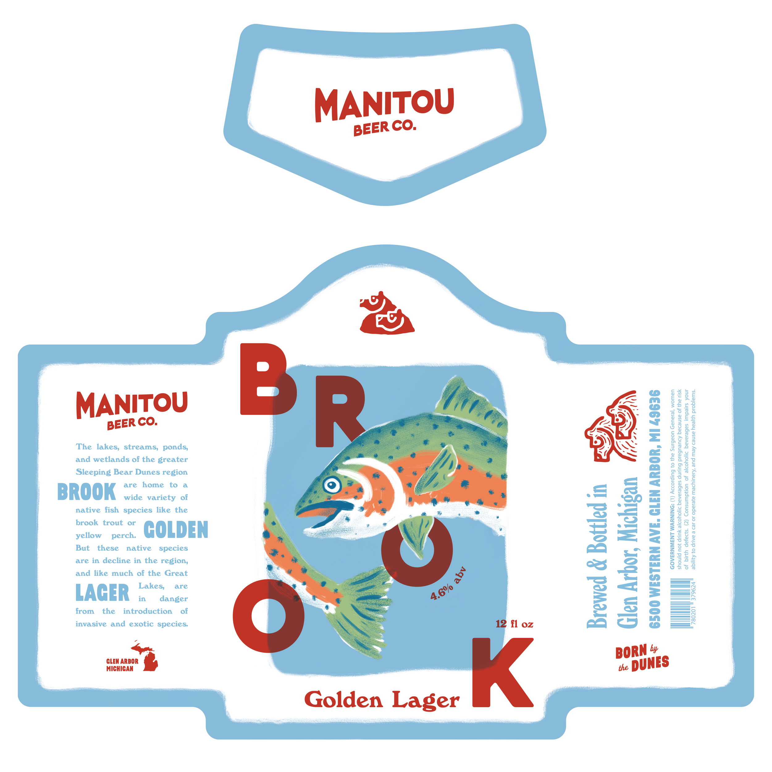
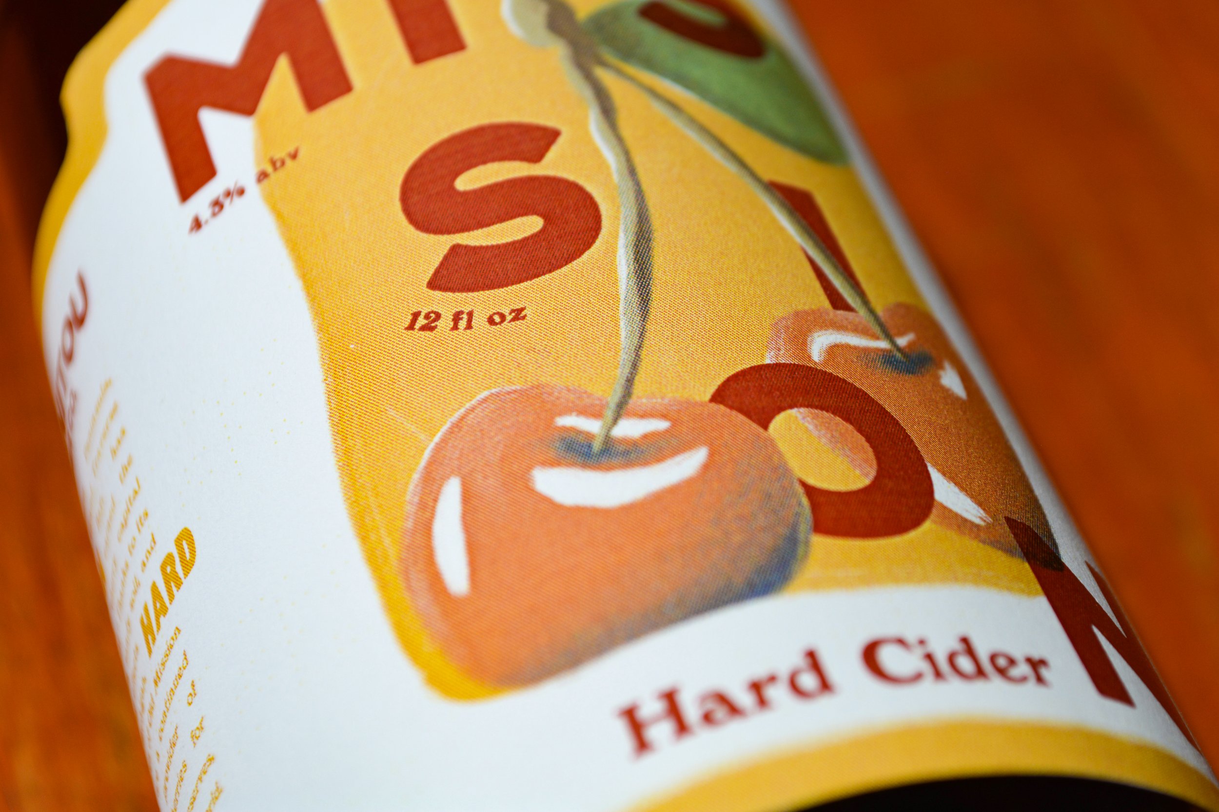
The labels themselves are where the brand comes to life. The designs emphasize natural aspects of the Sleeping Bear Dunes region. Brook Golden Lager is an ode to the wide variety of native fish in the area, while Heron Pale Ale is a dedication to the region’s 240+ species of birds. Aspen Amber Ale tells the story of Sleeping Bear’s forests, and Mission Hard Cider focuses on the region’s booming cherry orchards.


